By Prof. Madhu Krishna · 6 min read
Walk through the offices of almost any growing Indian company and play a little game: count the logos.
There’s the “real” one on the reception wall. A slightly stretched version on the visiting cards. A green that’s somehow turned teal on the factory signboard. A version someone pulled from Google Images for last month’s trade-show banner. And a squashed one in the email signature that nobody remembers approving.
Nobody did anything wrong, exactly. They just never had a rulebook. That rulebook is what we call a corporate identity manual.
In short: A corporate identity manual documents exactly how your brand should look and sound everywhere: logo, colours, type, imagery, layouts and voice. If more than one team, office or vendor produces material for you, you need one.
It’s a single reference that turns your brand identity from a logo file into a system anyone can apply correctly. You’ll hear it called brand guidelines, a brand standards manual or a brand book. The names overlap. “Corporate identity manual” tends to mean the fuller version used by larger organisations, covering everything from stationery to vehicle livery.
Corporate Identity vs. Brand Identity
The idea isn’t new. Some of the most admired design documents in history are identity manuals. The 1970 New York City Transit Authority manual by Massimo Vignelli and Bob Noorda, and the 1975 NASA manual by Danne & Blackburn, are still collected by designers today. Both have been reissued as books, decades later. A good manual outlives its era because it captures thinking, not just rules.
Every manual is different, but a solid one usually covers:
| Section | What it settles |
|---|---|
| Logo | Versions, clear space, minimum size, colour variants, and what never to do with it |
| Colour | Primary and secondary palettes with Pantone, CMYK, RGB and HEX values |
| Typography | Typefaces and hierarchy for print and screen |
| Imagery | Photography style, illustration and iconography |
| Layouts | Grids and templates for stationery, brochures, presentations and ads |
| Tone of voice | How the brand sounds, with real example lines |
| Applications | Signage, vehicles, uniforms, packaging, exhibition stands |
| Digital design system | Buttons, forms, spacing and components for web and apps |
That last row is newer, and increasingly important. A brand design system keeps your website and apps consistent with everything else, so the digital team isn’t quietly inventing a parallel brand.
Five signs your company needs one
Be honest about how many of these apply:
If two or more sound familiar, inconsistency is already costing you something: recognition, trust, or simply the time people spend redoing work.
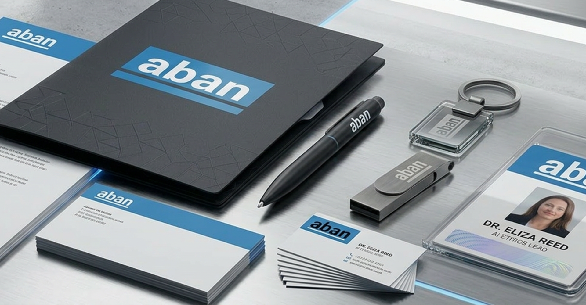
A rulebook people actually use
We’ve seen beautifully printed manuals that nobody opens. They sit in a cupboard looking expensive. The useful ones share a few habits:
There’s a reason this way of thinking feels natural to us. Swiss design, shaped at the Basel School of Design, is built on grids, clear hierarchy and disciplined consistency. Those same principles are exactly what make a brand system easy to follow at scale. (Its roots run back to the Bauhaus, which we’ve written about separately.)
Corporate identity has been at the heart of our work since 1985. Our brand guidelines and design systems practice covers corporate identity manuals, visual usage guidelines, typography standards, digital design systems and brand governance frameworks. You can see some of the identities behind them in our work.
If your logo count is higher than one, let’s talk.
A: In practice the terms are often used interchangeably. A corporate identity manual is usually the more detailed version for larger organisations, covering stationery, signage and multi-division use.
A: As long as it needs to be, and no longer. A small company might manage with 20 pages; a large group with many sub-brands can run past 100, often split into modules.
A: Many companies now keep an online version that’s easy to update, with a downloadable PDF and asset files alongside it.
A: ? Whenever you add a new channel, sub-brand or market, and as a habit, review them every few years.
A: A library of reusable interface components and rules that keeps your website and apps consistent with the rest of your brand identity.
A: Yes. Many companies document their existing identity first. It’s often the quickest way to stop the drift before deciding whether a refresh is needed.