Quick read: Great packaging design in India balances shelf standability, cultural resonance, and manufacturing practicality. It works at three levels — strategic (brand story), structural (material/form), and visual (color/typography) — and must perform in 3 seconds of shelf-scan attention while surviving real-world retail conditions across kirana stores, modern trade, and e-commerce. The brands that win combine distinctiveness with functional clarity, not just aesthetics.
India’s retail landscape is uniquely fragmented — over 12 million kirana stores alongside modern trade and quick commerce — meaning packaging often is the brand’s only marketing touchpoint at the point of decision. A product has roughly 3-5 seconds to register on a crowded shelf before a shopper moves on.
1. Stops the scroll/scan — visual distinctiveness against competitors
2. Communicates trust instantly — through material quality, typography, and finish
3. Survives the supply chain — heat, handling, humidity, and diverse retail formats
1. Structural distinctiveness, not just pretty graphics Shape, opening mechanism, and pack format often create more shelf impact than color or logo. A distinctive silhouette is recognizable even when the label is obscured or the pack is stacked.
2. Color as a strategic asset, not decoration Owning a color in a category (think of how instantly certain color-category pairings register) builds recall faster than any tagline. Random color choices dilute this entirely.
3. Typography that works at small scale Packaging typography has to remain legible at pack size, shelf distance, and thumbnail size on e-commerce apps — three very different viewing conditions most brand guidelines don’t test for.
4. Cultural fluency without stereotype Design that references regional aesthetics, festivals, or local sensibility (done with genuine understanding, not surface decoration) builds stronger emotional connection in Indian markets than imported design templates.
5. Consistency across a growing SKU range As brands expand from 1 product to 20, a packaging system (not a one-off design) is what prevents visual chaos and keeps brand recognition intact across variants.
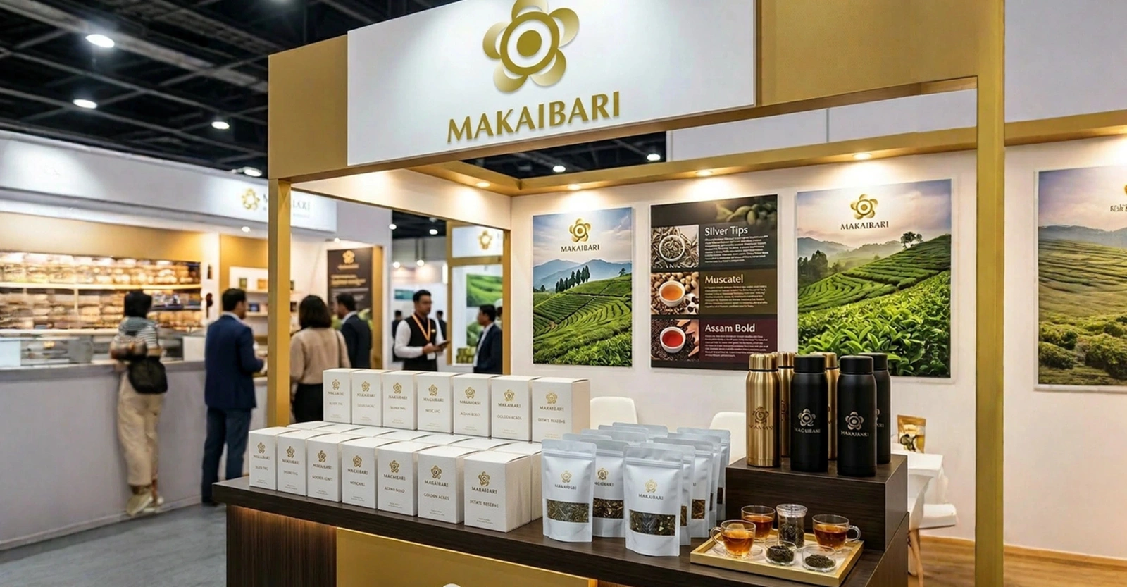
Packaging design that performs commercially — not just wins design awards — typically moves through: brand/positioning clarity → structural concepting → visual system design → prototype and shelf-testing → production-ready files with vendor specs. Skipping the shelf-testing step is the most common reason packaging looks good in a pitch deck but underperforms in stores.
A: A single-SKU packaging redesign typically runs 4-8 weeks from brief to production-ready files; a multi-SKU system with structural changes can take 8-12+ weeks.
A: Graphic design covers the visual layer (color, typography, imagery). Packaging design is broader — it includes structural form, material selection, and how the pack functions physically, in addition to the graphics.
A: Not the physical pack itself, but the front-of-pack hierarchy needs to work as a small thumbnail image, which retail-only packaging often isn’t optimized for.
A: It varies widely by scope — single-pack refresh vs. full multi-SKU system with structural design — so costs should be scoped against the specific brief rather than quoted as a flat number.
A: Yes. Packaging refreshes (color, typography, imagery updates) can happen independently of a full brand identity overhaul, as long as they stay consistent with the existing brand strategy.